QuickCart
Category
UI/UX
Year
2022
QuickCart is a UI/UX design project for a supermarket app, created as part of my capstone project for the Google UX Design Course. This project involved designing an intuitive and user-friendly interface to streamline the online grocery shopping experience. Using Figma, I developed detailed wireframes and prototypes, ensuring that the app's design met user needs and provided a seamless shopping journey from browsing to checkout.
User Research: Summary
I conducted interviews and created empathy maps to understand the users I’m designing for and their needs. A primary user group identified through research was working adults who don't have time to go to the shop to buy groceries.
User Research: Pain Points
- Working adults are too busy to spend time on going to the store to get groceries
- Platforms for ordering groceries usually do not ship fresh groceries
- Different modes needed with custom text and viewing modes for accessibility.
For the QuickCart project, I chose a primary color palette of #FFD67F and #CFD47E. I selected #FFD67F for its warm and inviting qualities, aiming to create a friendly and approachable interface that would enhance user engagement. To complement this, I used #CFD47E for its calm and natural tones, which convey stability and reliability. This harmonious color combination ensures a visually appealing design while reinforcing the app's usability and trustworthiness, contributing to a seamless and pleasant shopping experience.
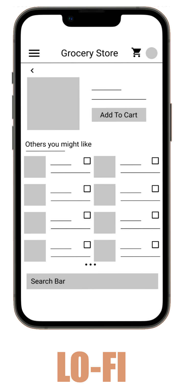
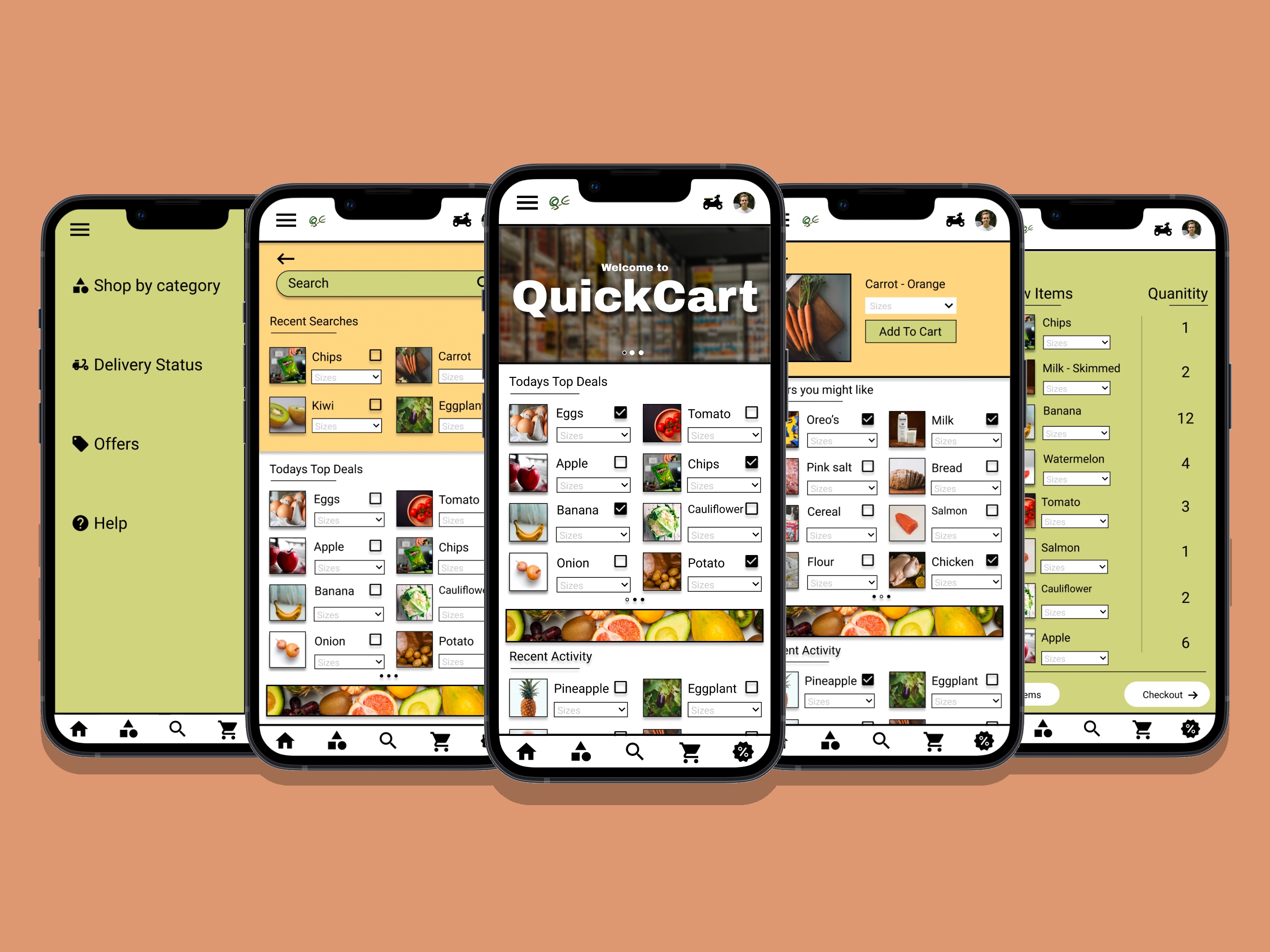
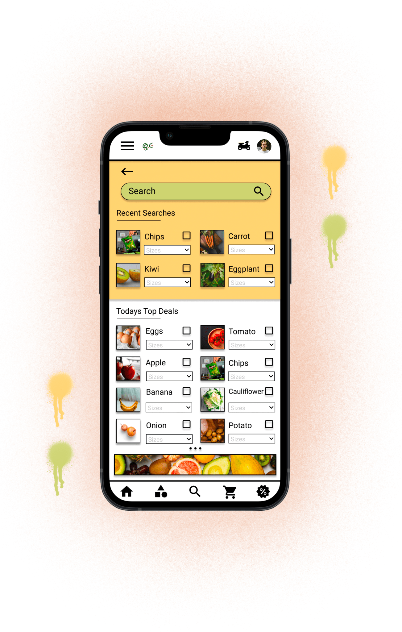
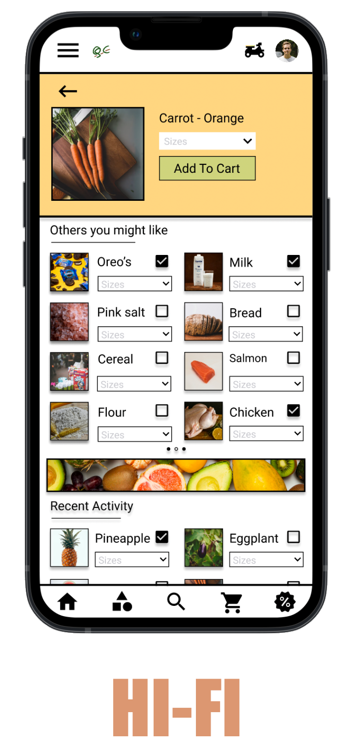
During the development of QuickCart, I began with low-fidelity wireframes to outline the basic structure and functionality of the app. These initial sketches focused on key elements such as navigation, layout, and essential features, providing a clear blueprint for the user interface. As I progressed and gathered feedback, I transitioned to high-fidelity wireframes, incorporating more detailed design elements and color schemes.
The low-fidelity wireframes allowed for quick iterations and adjustments based on user testing and feedback. As I learned more about user needs and preferences, I made significant changes to enhance usability studies and visual appeal. The high-fidelity wireframes reflect these improvements, showcasing a more polished and interactive design. Furthermore, after conducting usability studies, I enhanced the initial designs with additional options like 'Recent Activity' and incorporated a bottom navigation menu for swift access to key sections.
What I've learned
Designing the QuickCart supermarket app through the Google UX design course has been an illuminating journey, revealing the iterative nature of design and the invaluable role of user feedback. Initially, crafting the app's concept felt like the culmination of ideas, but I soon realized it was merely the starting point. The process unfolded in a series of iterations guided by usability studies and peer feedback. Each round of adjustments not only refined the app's functionality but also deepened my understanding of user preferences and behaviors. Working with tools like Figma and Adobe XD provided a hands-on experience in translating ideas into tangible designs. Through this project, I not only honed technical skills but also cultivated a mindset centered on user-centric design and continual improvement. It's a testament to the dynamic and iterative nature of the design process, where every iteration brings new insights and opportunities for enhancement.
© 2025